How Long is Retirement?
30 Years?
- 30 Years is a common assumption.
- The reasoning is that most people wait until they are eligible for Social Security and Medicare, which historically has been 65.
- Life expectancy past 65 is low. SSA (Social Security Administration) estimates that only 1 in 7 live to 95; that is 14%. (Reference: When to Start Receiving Retirement Benefits
Why it Might be Less?
- You worked until very late in life.
- You’re terminally ill.
- You’re only using retirement funds as a bridge to something else (inheritance, Social Security, pension, etc.)
This is Part Two - Please Read Part 1
If you haven’t read our prior posts on SWR and SWR Failure, please do so now. Those posts provide detail about the simulation and charts shown next.
Simulation Results
Reminder of what is shown…
Heatmaps
- Red points indicate failure (the account ran out of money), green points indicate success.
- These are based on SIMULATED returns given an asset class's average return and stdev; these use simulated returns, not historical data.
Historical Data
- These charts show the real return for a given investment strategy versus time, based on historical data, with success/failure for a given retirement start mapped on top of that in red/green
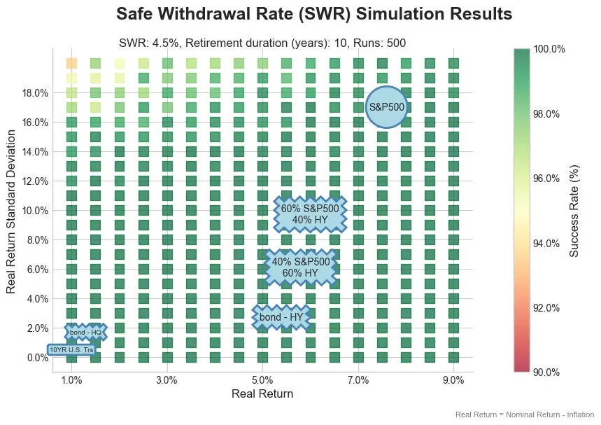
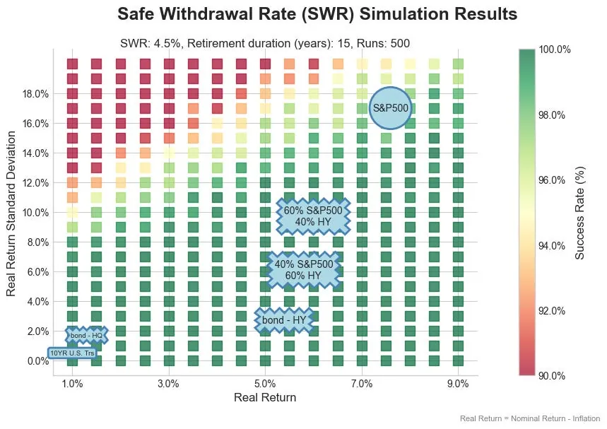
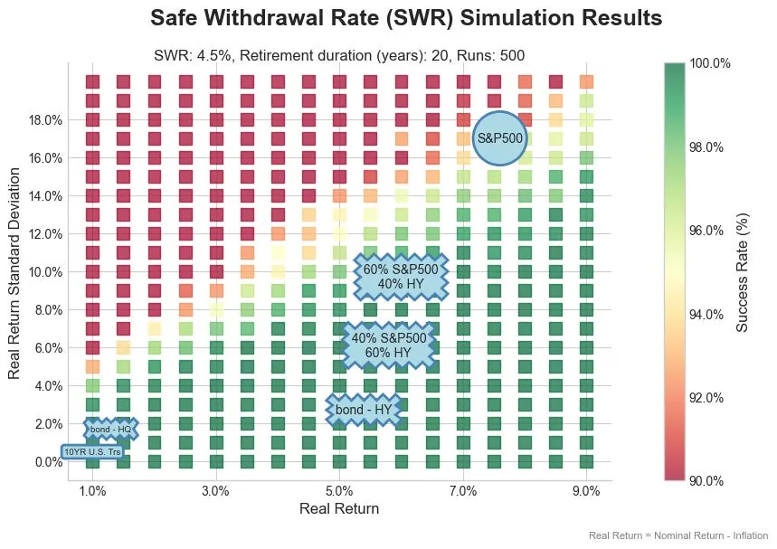
Charts for a 4.5% SWR for 10, 15, 20 and 25 Year Retirements
See chart titles for details (SWR, retirement years, etc.)
SWR: 4.5%, Retirement Duration: 15 years
SWR: 4.5%, Retirement Duration: 20 years
SWR: 4.5%, Retirement Duration: 25 years
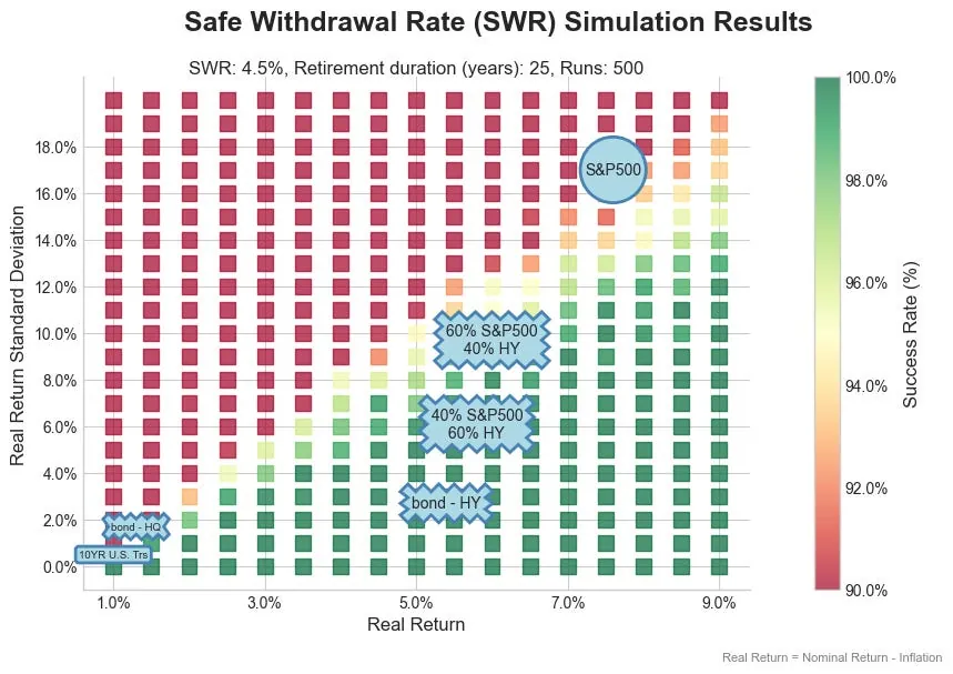
What these charts show
- For a retirement of 15 years or less, the investment space is largely “green”.
- For 20-25 years, investments with a stock profile (return and stdev) are becoming risky.
With an SWR of 4.5% being so successful for short periods, let’s look at a 6.0% SWR and 7.0% SWR for just 10-15 years.
Charts for 6.0% and 7.0% SWR at Shorter Retirement Durations
See chart titles for details (SWR, retirement years, etc.)
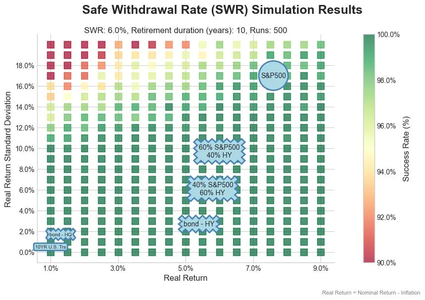
6.0% SWR, Retirement Duration: 10 years
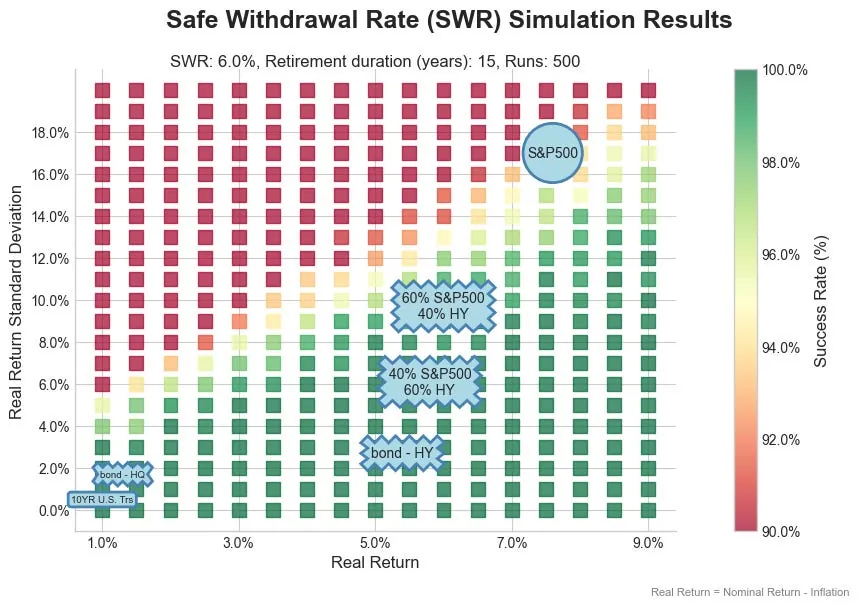
6.0% SWR, Retirement Duration: 15 years
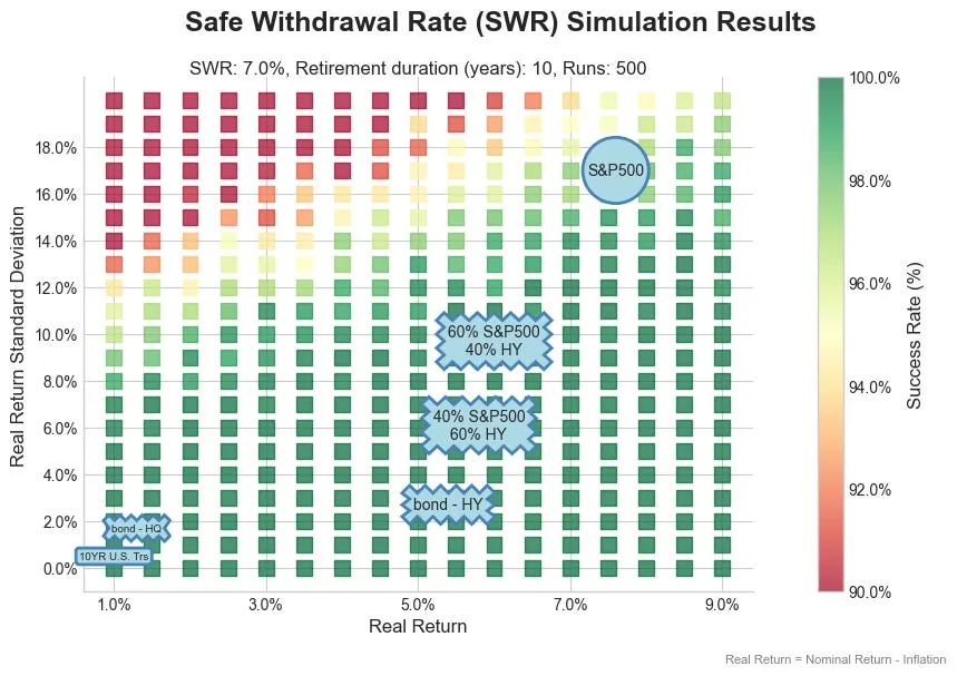
7.0% SWR, Retirement Duration: 10 years
7.0% SWR, Retirement Duration: 15 years
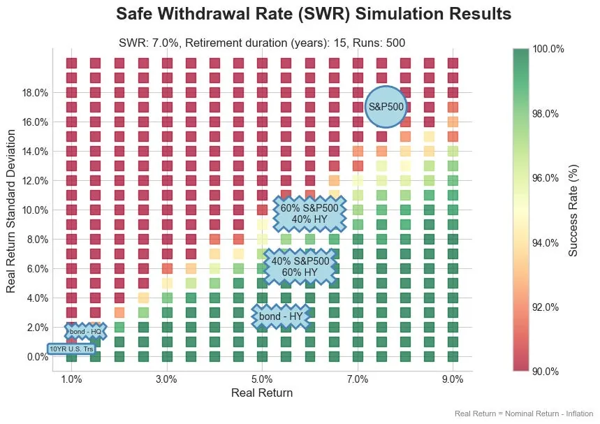
What these charts show
As you might expect, the shorter retirement periods allow for substantially higher withdrawal rates.
The heatmaps use simulated data based on an asset class's real return and stdev. Let’s take a look at how some of these scenarios play out against historic data.
Historic Simulation - 20 Year Retirement, Starting in 1920, 4.5% SWR
See chart titles for details (SWR, retirement years, etc.)
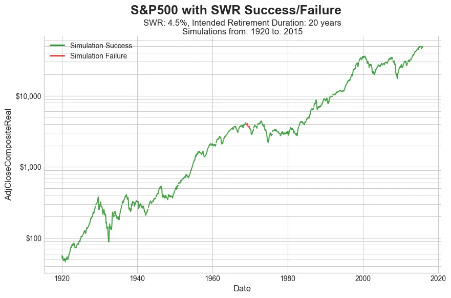
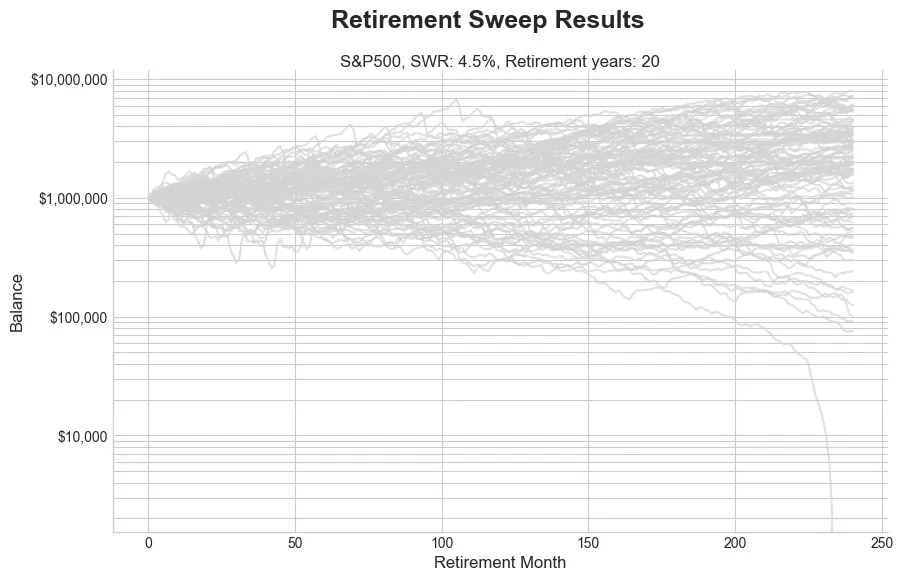
These charts are for a 4.5% SWR, for a 20 year retirement, invested 100% in the S&P500. (We simulate a retirement for every year, starting in 1920, until 2015. For years after 2010, less than 20 years are simulated.)
- We ran a 15 year retirement and it had zero failures since 1920.
- The chart of real return for a 20 year retirement shows a single failure for retirement starting in 1969. (See the red line segment in the otherwise green line.)
- The balances chart (balances from each simulation starting in 1920) shows the failure and some lower balances.
- 100% stocks is not a recommendation, but used to show that at this shorter retirement duration a portfolio can take more risk with a 4.5% SWR.
Running against historic data shows the portfolio was a bit more robust than when based on simulated returns.
Historic Simulation - 10 Year Retirement, Starting in 1920, 8.0% SWR
See chart titles for details (SWR, retirement years, etc.)

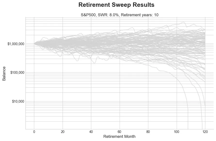
These charts are for a 8.0% SWR, for a 10 year retirement, invested 100% in the S&P500. (We simulate a retirement for every year, starting in 1920, until 2015. For years after 2010, less than 20 years are simulated.)
- We ran a 10 year retirement at 7.0% SWR and it had zero failures since 1920.
- The 8.0% SWR chart of real return shows two failures for retirement starting in 1973 and 2000. (See the red line segment in the otherwise green line.)
- The balances chart (balances from each simulation starting in 1920) shows the failures and some lower balances.
- Again, this is not a recommendation, but used to show that at this shorter retirement duration a portfolio can take more risk with a higher SWR.
Key Takeaways
- Retirement duration of less than 30 years may be appropriate for some.
- For these shorter durations, SWR can be increased, and the portfolios can withstand higher volatility.
“Just because you can, doesn’t mean you should”
Again - these are not recommendations. Just because simulations and historical data suggest you could take on more risk, doesn’t mean you should. The optimal approach is generally to take on the LEAST risk, at a real return required to get to the desired SWR.