We’ve covered the 4% Rule in our post Understanding Safe Withdrawal Rate. The 4% Rule is one example of a Fixed Safe Withdrawal Rate. (“Fixed” refers to the fact that the withdrawal rate is fixed in terms of real dollars; or dollars of constant purchasing power. The withdrawals are allowed annual inflation adjustment.)
The 4% Rule (revised to the 4.5% Rule) has since been built upon by various other strategies that involve variable rates. (We will be publishing an extensive post on different strategies shortly.)
A question this often raises is, “Why vary the withdrawal rate? Why not just start with a higher withdrawal rate?”.
In our post Safe Withdrawal Rate Failure, we showed how failures generally happen during prolonged periods of low or no real returns. (Where “real return” here means inflation adjusted return, as opposed to nominal return.) That implies that the longer a retirement is designed to last, the higher the probability of encountering such a period.
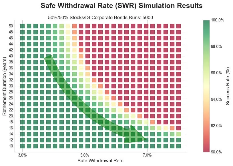
We’ve modeled a fixed safe withdrawal rate, using a portfolio of 50% stocks and 50% investment grade corporate bonds, for durations of 10 to 40 years. The model is a statistical (Monte Carlo) model that uses 5000 runs at each duration and withdrawal rate. The success rate was recorded and charted below.
-
The green arrow shows a path of decreasing years in retirement.
-
Early on, the slope of the arrow is quite steep, indicating any increase in withdrawal rate comes with high risk.
-
Later on, the slope of the arrow is quite shallow, indicating withdrawal rate can be increased rapidly without taking on increased risk.
-
If you have enough money to live on about 3.5% or less of the portfolio, your retirement can last indefinitely. You will likely pass money on when you pass.
- For a retirement shorter than 10 years, you can use a relatively high withdrawal rate; up to about 8%.
It’s the nature of this curve that enables variable withdrawal rate strategies to work. Once you have succeeded at a given withdrawal rate, your remaining retirement years move you lower, and into yet safer (more green) space. Once well into safe space, you can then move right and increase your withdrawal rate while still staying at or near 100% predicted success.
Another mechanism that enables higher withdrawals later in retirement is that once you have survived early Sequence of Return Risk, there is a possibility that you will have excess funds. The compounding of those excess funds can also enable higher than initially planned withdrawals, as the higher balance effectively reduces withdrawal rate.
Free Download: The AlgorithmicFIRE Curriculum Book
Download our complete 200+ page guide on Safe Withdrawal Rates, sequence of returns risk, tax optimization, and asset allocation to read offline on any device.
Disclaimer
For Educational Purposes Only: All content on this site, including articles, tools, and simulations, is for informational and educational purposes only. It should not be construed as financial, investment, legal, or tax advice. The information provided is general in nature and not tailored to any individual's specific circumstances.
Software Development & Data Processing Risks: The software used to perform the analyses may have errors or inaccuracies. When we post updates to any material, errors or inaccuracies that are subsequently fixed may change the results. Historical pricing revisions, corporate actions, or algorithmic optimizations may dynamically recalculate past simulation timelines. As a result, past signal sequences shown on this site or in digests may shift retroactively to align with the revised data.
No Guarantees & Risk of Loss: The analyses and simulations presented are based on historical data. Past performance is not an indicator or guarantee of future results. All investing involves risk, including the possible loss of principal. Market conditions are subject to change, and the future may not resemble the past.
No Fiduciary Relationship: Your use of this information does not create a fiduciary or professional advisory relationship. We are not acting as your financial advisor.
Consult a Professional: You should always conduct your own research and due diligence. Before making any financial decisions, it is essential to consult with a qualified and licensed financial professional who can assess your individual situation and objectives. We disclaim any liability for actions taken or not taken based on the content of this site.
Data Sources & Attribution: This site utilizes the FRED® API provided by the Federal Reserve Bank of St. Louis. This product uses the FRED® API but is not endorsed or certified by the Federal Reserve Bank of St. Louis. All FRED® data is used strictly for internal analytical processing and research.
Third-Party Links & Endorsement: This site contains links to third-party websites and resources for your convenience. We have no control over the content, privacy policies, or practices of these sites. The inclusion of any link does not imply endorsement, sponsorship, or recommendation by Algorithmic Fire LLC. We are not affiliated with any third-party sources unless explicitly stated, and we disclaim any liability for information or services provided on these external platforms.
Regulatory Status: Algorithmic Fire LLC is not a registered investment adviser, broker-dealer, or financial planner, and is not affiliated with the Securities and Exchange Commission (SEC) or the Financial Industry Regulatory Authority (FINRA). The content, tools, and simulations provided on this site do not constitute, and should not be construed as, professional financial advisory services.
Copyright 2025-2026 Algorithmic Fire LLC. All rights reserved.